How We Designed The Cover For One Pan Pescatarian

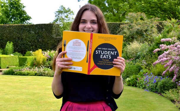
One of the things that caused me the most anxiety writing my first cookbook, Student Eats (ad), is that I did not know what the cover looked like until the day it was uploaded to Amazon for the first time. No idea, no idea at all. This time around one thing I felt very strongly about was getting as much input as possible into the look and feel of the book, especially the cover because that is the first thing most people will see.
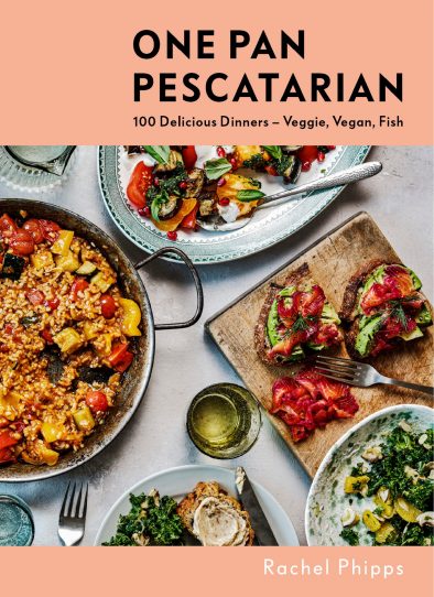
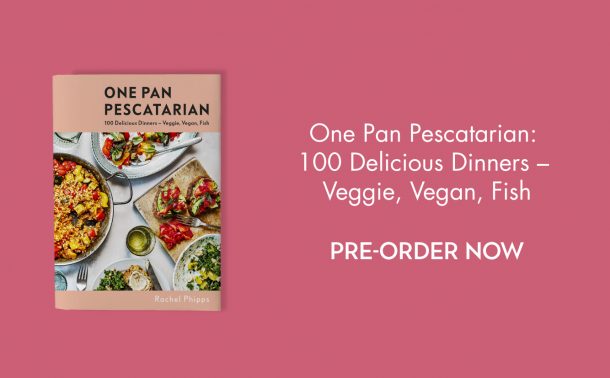
As it turns out, I ended up pulling together an idea for a cover design that everyone working on the book loved, and ended up translating to what you see now. And, after reading Michelle’s brilliant post about how the cover of her new book, Weeknight Baking: recipes to fit your schedule (ad) was designed, I figured it might be nice to give you a little peek at how we arrived at the frankly beautiful cover for One Pan Pescatarian (ad).
The idea
The cover started with a conversation with my editor in the cafeteria at my publishers (fellow authors: do you find too it is the case you always meet in the cafeteria? Most of my meetings have been there at both of the publishing houses I’ve worked with!) about how we thought it should look. For some reason I’d had some sort of image of it in my mind for a while: a pink border, a table spread with lots of dishes in the middle. My editor on the other hand had had an illustrated cover in mind, like Midnight Chicken (ad – I know this is an affiliate link but whatever you do buy this book for the food writing alone. It is also the only cookbook that has ever made me cry when I got to the end) but happily for me that idea had already been squashed by the marketing department.
She asked me to work up some ideas, and send them over.

I put together a document of cookbook covers I loved, had done well (in publishing whatever the genre being able to compare a book to something similar that has already sold really well is really important as it reduces risk to the publisher, it lets them know that there is already an appetite out there for the book in question) and that had elements that I thought were right for One Pan Pescatarian, making sure to draw attention to the bits I thought were particularly good, and the bits I was not that fussed about.
One cookbook I brought up there on the screen in the meeting is one I own and love: Dinner: changing the game (ad) by Melissa Clark. It’s a brilliant book full of creative, yet accessible weeknight dinners, with a one-pan chicken dish as the hero recipe on the cover as part of a dinner spread. It was a lot darker than what I – and I think also my publishers – had in mind, but it had the right sort of layout to illustrate what I was after.
Another cover from my collection I brought up then and there was that of Kachka (ad), a ‘Russian’ (more accurately of the former Soviet bloc countries) cookbook from the Portland restaurant of the same name. I adore it; it is funny, informative and the recipes are both educational and brilliant, but one of my favourite things about it is it’s cover. It’s bright, colourful, but more importantly it shows a riot of dishes from the book, ready for feasting.
The main idea behind One Pan Pescatarian is that it is a book of (mostly: there are the odd brunch dish and lighter dish that is more weekend lunch friendly in there too!) weeknight dishes that can be cooked all in one pot or all in one pan. However, I know real life and real cooking does not necessarily work like that: you may have a big family, or you may want to make feasting at home easier by doing a load of one pan dishes. There are a few mix and match menu ideas at the front of the book exactly in this spirit, but from the cover I wanted to portray this idea of eating together. Also, I don’t know about you, but I like to know as much as possible about a book from its cover, and what better way to do this than to pack in as many dishes as possible?
Next, I did a lot of research. That evening after the meeting with a glass of wine I went through my entire shelf of cookbooks, looking at their covers, seeing if there were any more that illustrated my vision. I also went through about 20 pages of the Amazon ‘Quick & Easy Meals’ chart – somewhere I knew both my cookbooks sat – for more recent and best selling inspiration.
From my own shelves, Tiny Food Party!(ad) is a book I’ve never cooked from, but is great for inspiration written by the blogging duo behind Spoon Fork Bacon, and L.A. based blog that used to sort me out for what to do with all my seasonal farmers market fruit and veg when I loved out there. While I wanted something a bit more natural for my cover, again I lived how a lot from the book was shown at once. In my notes, I also noted that the food on the plates themselves were very natural, just thrown together rather than being over stylised.
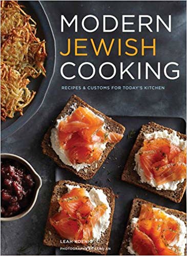
Modern Jewish Cooking (ad) is not one of mine, but a book I got my mother for a birthday a few years ago (by the way, do you have a copy of the author Leah Koenig’s latest book The Jewish Cookbook (ad / gifted) which is frankly incredible, the most comprehensive guide to modern Jewish eating across the world you could ever need?) While there are a few dishes on the cover that go together and really tell you what the book is about (hello latkes and lox) I used this to illustrate what I really did not want – something way too close up on the food, and something rather too dark. Look around you, look at my blog. Things are light, bright and colourful around here!
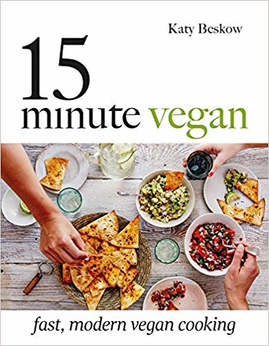
Two books that were more in line with what I was after – panel blocks for the text and feasts of the food in natural, mid-meal settings – that I don’t own but found online are Let’s Do Dinner (ad) and 15 Minute Vegan (ad). We talked a lot about these in the next meeting we had at my publishers – a big creative meeting with lots of people, and, most importantly our photographers and the book designer – for the first time.
On both we loved the laid back, mealtime feel, the plates half filled with food being shown as well as the dishes, and the lovely, natural backdrops that mimicked table tops. The marketing and creative team from my publishers felt that showing hands on the cover was a big no and I did not have an issue with that. We also agreed no flowers, but we’d try out candles on set and see how it went (we did not end up using them). I’m not big on linens in pictures, but we also decided just to see how it went on set, and in the end we decided that we wanted all the dishes to stand on their own. They’re one pan meals, after all. So, happily for me, there was to be no table linens on the cover either.
Let’s Do Dinner I think, along with Dinner: changing the game was the cover that related the look and feel I was after the most. It probably also helped that my cover was pink in my head. I have no idea why, it just was!
Choosing the recipes
Then, it was just up to me to choose the recipes that would go on the cover. Honestly, I’m still pinching myself that I got so much control over the creative direction of the cover as I type this.
There needed to be a balance of dishes from each chapter – veggie, vegan and fish – they all needed to work somewhat cohesively together as one coherent feast, and probably most importantly, they all needed to be really photogenic and beautiful.
This was very tricky. There were recipes I loved and I simply new I wanted on the cover – my Beetroot and Dill Cured Salmon, piled onto avocado toast as it is just so colourful and beautiful – for example, while other dishes simply made sense to be part of a big spread as they’d work just as well as part of a big spread than as a light meal in their own right, like my Tomato, Black Olive and Courgette Bread with Anchovy Butter. Salads also worked really well as they could be re-employed as sides.
However, we needed one big hero dish, shown in the pan to really scream ‘one pan’ to go quite near the middle of the cover, and to be at the centre of the big main spread. Originally I chose the One Pan Smoked Salmon Kedgeree for this, because of it’s beautiful yellow cover. However, almost everyone in the creative team was against this, and it got changed to my Veggie Paella.
I was really worried about this, because I honestly did not think I could make that dish beautiful enough for the cover. But, Octavia, our wonderful shoot assistant reassured me she could make the paella – a very tricky dish as it is (though don’t worry, my version is very simple to follow and get right!) – look good enough to be a hero dish. Looking at the final shot for the kedgeree, then the cover, they were all right!
One of the biggest lessons I’m so glad I’d already learnt on Student Eats before starting on One Pan Pescatarian is that cookbooks are collaborative works for a reason. Yes I’m the one what wrote it and I’m the one with the name on the cover, but every single person at every single stage is there because they’re an expert. Pick your battles, understand that sometimes you as the author are not always right, and because you’ve not made a massive fuss over every little thing, your voice will be heard when there is something that really matters to you and really is important that you want to shout about.

Shooting the cover
The start of our cover shoot found me the day before on a rail replacement bus service from London Bridge to my home in East Dulwich with half a side of salmon curing in beetroot, sea salt and dill, obsessively sealed and stashed in my suitcase. I’d had my heart set on it appearing on the cover (and I’m so glad I went to the extra effort) because it had to be prepared a few days in advance, and because I was due to judge another year of the Canterbury Christmas windows that Saturday, I had not choice but to cure the salmon in Kent, and then travel with it!
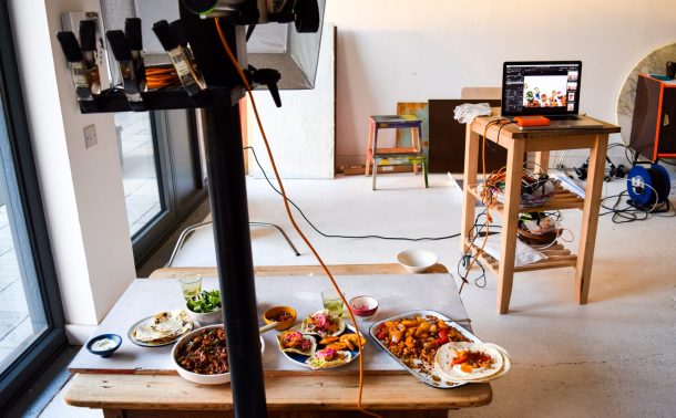
Shoot day was a studio packed full of people, shooting directly into a mock template our designer Nikki had made to fit the cover dimensions, which you can see in the picture above. We shot loads of different versions so the marketing teams and everyone had loads of different options to work with. The two big debates we figured could be sorted out later was if we should use the wooden backdrop you can see on the left that looks a lot like a kitchen table, or the off white backdrop on the right, which looks more like an outdoor table.
Another big debate for the marketing team was if we should have fish on the cover, which apparently is a rather controversial topic for sales, even for a book with ‘pescatarian’ in the title! In the end we had the salmon on the cover (not overtly fishy, and still very beautiful) and the big pan of Hot Prawns in Garlic Butter as the hero shot for the back cover.

Choosing the colour
While I was honestly not all that fussed if we went for the off white stone / outdoor table style background we shot or the wood (though secretly the off white was my first choice and I’m so glad it is the one we finally went for!) I had so many feelings about the final cover colour that was going to be used both on the panels front and back, and on the spine.
Nikki ran up several design options with the positioning of my name, the tagline etc., and I loved them all. However, it was all the different colour mock ups I had very strong thoughts on.
Originally we had the above pink in mind, which is always how the book looked in my head. But, that got vetoed by the marketing department so we had to go back to the drawing board…


Here is just a sample of some of the colour options we discussed. We liked the mustard yellow, but thought it would clash a bit with the cover for Student Eats when they’re displayed next to each other online places like Amazon. Lots of people involved in the book were really, really keen on this green number which I, with no rhyme or rational reason, hate. I remember texting as much to my best friend on one of my daily walks and brainstorming what I should do if the green was decided upon.
In the end, even though marketing thought the colour would effect sales, we all still liked how the pink looked visually, and we were also fans of an orange one that looked good, but just was not quite right. So, I suggested that we try a peach colour. Neither pink or orange. And so, the final, beautiful peachy cover for One Pan Pescatarian was born.

So, here it is. The final, beautiful, wrap around cover for One Pan Pescatarian, which is out tomorrow. I’m so, so excited for this beautiful book to be out in the world. Remember, if you’ve not already done so, you can order a copy here (ad). Prime might even be able to get it to you by dinnertime tomorrow!





Discussion